We spend a lot of time hyping up new CSS features, and for good reason. The language has matured incredibly over the last few years. But in our rush to adopt the newest specs, we often overlook the perfect companion that's been sitting right under our noses the whole time: currentColor.
Long before CSS Custom Properties (var(--my-color)) revolutionized how we write stylesheets, currentColor was the original native CSS variable. Today, leveraging this legacy keyword is still one of the most effective ways to keep your code DRY, especially when building lightweight or classless CSS frameworks where every byte and declaration counts.
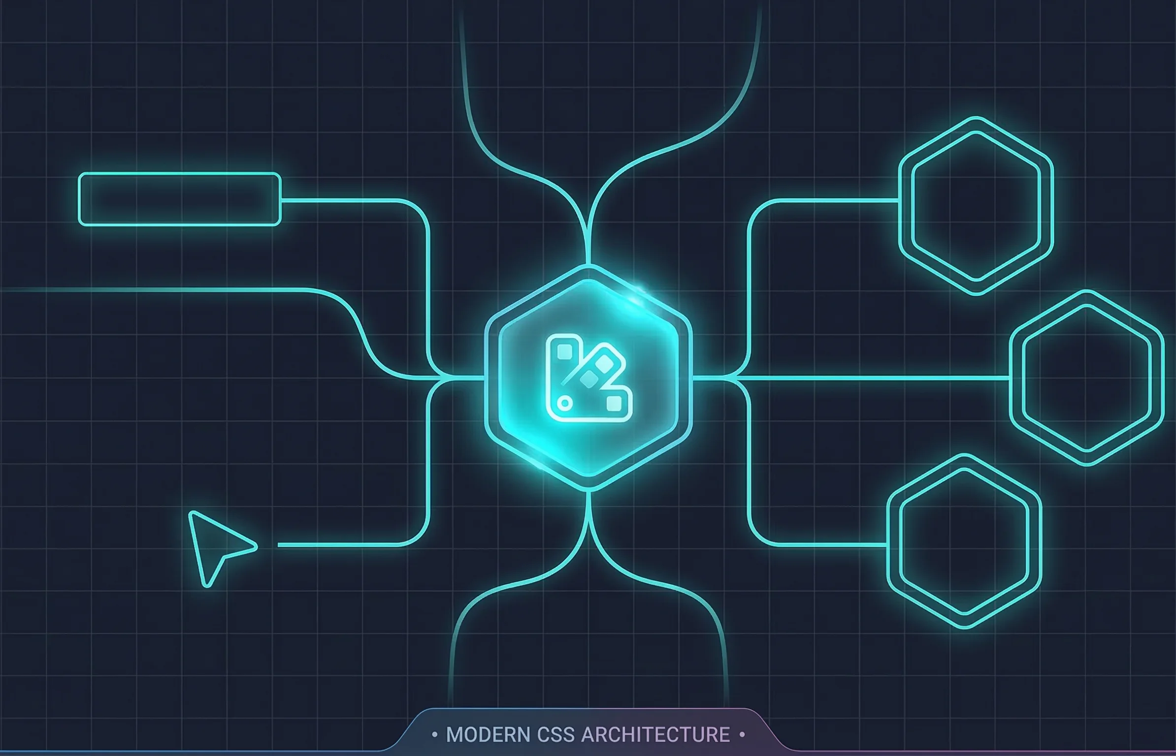
Here is why currentColor deserves a central spot in your modern CSS architecture.
The Original Variable
At its core, currentColor does exactly what it says on the tin: it holds the computed value of the color property for the current element. If you don't explicitly declare a color on that element, it simply inherits the value from its closest parent in the DOM cascade.
Why does this matter? Because it allows you to dynamically theme properties that aren't the text color, without writing a single extra custom property or hex code.
Keeping Interaction States DRY
Think about a standard outlined button component. When a user hovers or focuses on it, you usually want the text, the border, and maybe a subtle box-shadow to change color in unison.
Without currentColor, you end up repeating yourself, or writing overly verbose custom properties:
/* The verbose way */
.btn-outline {
  color: var(--theme-primary);
  border: 2px solid var(--theme-primary);
}

.btn-outline:hover {
  color: var(--theme-primary-hover);
  border-color: var(--theme-primary-hover);
}
By leaning into currentColor, you set the border to inherit the text color dynamically. Your hover states become incredibly lean:
/* The DRY way */
.btn-outline {
  color: var(--theme-primary);
  border: 2px solid currentColor;
}

.btn-outline:hover {
  color: var(--theme-primary-hover);
  /* The border color automatically updates! */
}
This tiny shift in architecture prevents redeclaring the same color values across different properties.
The SVG Superpower
If you take nothing else away from this post, let it be this: currentColor is a design system's best friend when it comes to iconography.
Hardcoding fill="#000000" inside an inline SVG creates rigid, brittle components that are a nightmare to theme for dark mode or specific interaction states. Instead, set the fill (or stroke) to our favorite keyword:
<svg width="24" height="24" fill="currentColor" viewBox="0 0 24 24">
  <path d="..." />
</svg>
Now, the icon acts exactly like a text character. Drop it inside a blue button, and it turns blue. Drop it inside a dark-mode wrapper with white text, and it turns white. It becomes entirely environment-agnostic, responding perfectly to the cascade without requiring a specific .icon-dark or .icon-blue utility class.
Modern Synergy
currentColor isn't a replacement for modern custom properties; it's the perfect teammate. By using var(--theme-color) on a parent container, you can let currentColor push that value down to borders, shadows, SVGs, and pseudo-elements seamlessly.
It is the key to building resilient, portable UI components that adapt to their surroundings automatically. And once you master this inherited behavior, you unlock the ability to do some truly mind-bending dynamic theming using modern relative color syntax, but we'll save that for the next post.